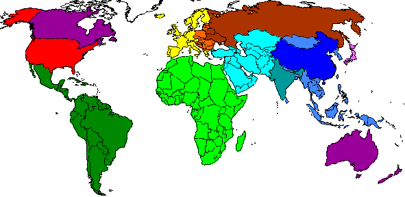
These 12 regions are used in all the Regional Data plots
The six regions in warm reds, yellows, browns correspond to Annex B countries which agreed an emissions reduction target under the Kyoto protocol. The cool greens and blues are the developing countries.
The legend is given by the strip of coloured squares to the right of any regional plot. Move your mouse over each one to see its name pop up.
The regions are composed of countries sharing similar percapita emission histories as well as geographical proximity, and have no political significance.
Future regional socioeconomic and baseline emissions data is derived from RIVM's implementation of the SRES scenarios using the IMAGE model. (Note SRES itself only reported data for 4 regions, whilst JCM has 12 and IMAGE has 17). These data are normalised to ensure consistency with totals tabulated in SRES.
Future regional emissions may reduced, according to various distribution formula.
Later we might make an option, to show specific curves for any country, or to make regions from any combination of countries.